Creating Modal Dialogs with AngularJS and Custom Directives
Introduction
Adding modal dialog boxes to your web pages is a common task for web developers. The idea is pretty simple: a box (e.g., div) is positioned somewhere on the page, usually centered. The box has a high z-index so it appears to be floating on top of the underlying page. I like to include styling that gives the box a border radius and maybe a shadow. I also like to gray out the underlying page as a visual queue and to let the user know that he/she needs to address the dialog first, before attempting to interact with the main page’s UI. Inside the box, you can put anything you want from a simple message with a close button to a more sophisticated form that includes any number of visual elements.
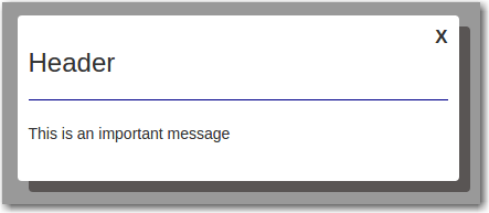
Here’s what our simple modal will look like:
With a bit of CSS, it’s fairly easily roll out your your own custom modal using a div that’s shown when the box is opened and hidden when it’s closed. But rather than reinvent the wheel, most developers reuse existing templates, plenty of which are out there on the Web and are open source. For example, I’ve used the standard jQuery and Bootstrap modals quite a bit on previous projects. However; they can be a bit limited. In other words, there may not be a lot of config options you can choose from to make the modal look and behave exactly the way you want. This is not typically a big problem as the standard modals do the trick most of the time and if you get desperate, you can always try to override the default behavior with more CSS. Nonetheless, the cleaner solution is arguably to just roll out your own modal.
Another thing to consider when using a standard modal is whether or not it’s designed to play nice with AngularJS. If your page is Angularized, then you may want to try the UI Bootstrap modal, designed by the Angular UI team. Not ony doees the UI Bootstrap modal work seamlessly with Angular, it’s actually written in Angular. It has a lot of config options too, giving it a good deal of flexibility. Most normal developers (not us) would likely shy away from looking under the hood to see how the UI Bootstrap modal is implemented, mostly because there’s no need to do so when developing a typical web application. However; if you’re of a curious sort (as I know you are), I’ll give you the short run down. The UI Bootstrap modal is nothing more than a custom Angular directive. The code is open source, so it’s no big secret. Feel free to check it out at UI Bootstrap.
If you’re planning to roll out your own modal, then why not implement it as a custom Angular directive? The benifits would include being able to make the modal look and behave exactly as you like, while also taking advantage of full compatibility with Angular. It’s really not that hard. This blog post will show you how, step by step!
What Are Angular Directives?
So what exactly are angular directives? Simply put, Angular directives are markers on DOM elements. In fact, Angular is built using directives, so if you’ve been using Angular, then you’ve no doubt been using directives. For example, ng-app, ng-controller, ng-repeat, ng-click and ng-show are all implemented as directives. Note that all of the above examples are of directives that are marked as attributes on their respective DOM elements. As you’ll see, you can also create directives that are marked as element names.
Directives contain behavior that is attached to the DOM element containing the marker. The general rule of thumb is, if the marker changes the behavior of the element then it should be marked as an attribute. On the other hand, if the directive creates a new element with all new behavior, then it should be marked as an element name.
Directives can insert HTML, manipulate the DOM and execute code. For a comprehensive set of information about creating directives, you can go to Creating Custom Directives. However; it’s not necessary to read through that now, as I will explain things as we go through our simple example. Just keep in mind that directives can do a whole lot more than create modals, so you’ll want to keep the above link handy as a reference for future projects.
Creating a Simple Modal
In this post, we’ll create a simple modal implemented as a directive, that displays a message and includes a close button. I’ve created a plunk here: Simple Modal Plunk.
The example is split into the following files:
| File | Description |
|---|---|
| index.html | Main HTML page |
| modalDialog.html | Modal dialog template |
| script.js | Angular code behind |
| style.css | Custom CSS styling |
The HTML file
First, let’s take a look at the head section of the index.html file:
<head>
  <link href="//maxcdn.bootstrapcdn.com/bootstrap/3.3.2/css/bootstrap.min.css" rel="stylesheet" data-semver="3.3.2" data-require="bootstrap@*" />
  <script src="http://code.jquery.com/jquery-2.1.4.min.js" data-semver="2.1.4" data-require="jquery@*"></script>
  <script src="//maxcdn.bootstrapcdn.com/bootstrap/3.3.2/js/bootstrap.min.js" data-semver="3.3.2" data-require="bootstrap@*"></script>
  <script data-require="angular.js@1.3.15" data-semver="1.3.15" src="https://code.angularjs.org/1.3.15/angular.js"></script>
  <link rel="stylesheet" href="style.css" />
  <script src="script.js"></script>
 </head>
As you can see, we’ve included bootstrap and jQuery. We use bootstrap to style some of the elements on our page, but we don’t use it to create the modal. jQuery is needed for Angular. If you omit jQuery, Angular will include a stripped down version of jQuery, but I always like to have the full jQuery on hand in case I need it. So don’t forget to place the script tag to include jQuery before the tag that loads Angular. Finally, we include our own custom CSS and JavaScript files.
Now let’s take a look at the body of our index.html file:
<body ng-controller="indexCtrl">
  <h4 style="margin-left: 10px;margin-top: 20px;">Display a modal dialog with AngularJS</h4>
  <hr />
  <button ng-click="toggleModal()" class='btn btn-warning btn-sm'
          style="margin: 5px 0px 10px 10px;width: 150px;">Open Modal</button><br />
  <!-- Angular JS Directive Modal -->
  <modal-dialog box-width="400px" box-height="150px" show="modalShown">
    <div class="row">
      <div class="col-md-12">
        <h3>Header</h3>
        <hr style="border-top:1px solid darkblue"/>
      </div>
    </div>
    <div class="row">
      <div class="col-md-12">
        This is an important message
      </div>
    </div>
  </modal-dialog>
</body>
First we include a simple header for our page followed by a horizontal rule and a button that, when clicked, will open our modal dialog. Next, and this is the most important part, we introduce a new element called modal-dialog. The HTML inside this new element is the content of the modal, which as you can see relies on the bootstrap grid system for its layout.
Also note that the new modal-dialog element contains custom “box-width” and “box-height” attributes. This sets the size of the modal. The new element also contains a funny looking attribute named show, which is set to “modalShown”. I’ll explain the how those box-height and box-width attributes work as well as the meaning of the show attribute a little later in this post.
Finally, note that the body tag in our index.html file contains an Angular ng-controller directive. We’ll implement this angular controller (called indexCtrl) in our script.js file in addition to our custom directive.
The JavaScript
Now let’s take a look at the contents of the script.js file:
angular.module('app', []);

angular.module('app').controller('indexCtrl', function($scope) {
  $scope.modalShown = false;
  $scope.toggleModal = function() {
    $scope.modalShown = !$scope.modalShown;
  };
});

angular.module('app').directive('modalDialog', function() {
  return {
    restrict: 'E',
    scope: {
      show: '='
    },
    transclude: true, // Insert custom content inside the directive
    link: function(scope, element, attrs) {
      console.log('attrs: ' , attrs);
      scope.dialogStyle = {};
      if (attrs.boxWidth) {
        scope.dialogStyle.width = attrs.boxWidth;
      }
      if (attrs.boxHeight) {
        scope.dialogStyle.height = attrs.boxHeight;
      }
      scope.hideModal = function() {
        scope.show = false;
      };
    },
    templateUrl: 'modalDialog.html'
  };
});
At the top of the file, we create an Anglular module for our app, appropriately named “app”
angular.module('app', []);The Angular Controller
Next we have the implementation of our Angular controller:
angular.module('app').controller('indexCtrl', function($scope) {
  $scope.modalShown = false;
  $scope.toggleModal = function() {
    $scope.modalShown = !$scope.modalShown;
  };
});
There really isn’t much in our controller, just a scope variable called modalShown and a function called toggleModal, which essentially toggles the value of the modalShown variable. Notice that the toggleModal function is called whenever the “Open Modal” button is clicked in the UI. This is done via the ng-click directive marked as an attribute of the button tag in the HTML.
The Directive
The last part of the JavaScript is the creation of our custom Angular directive:
angular.module('app').directive('modalDialog', function() {
  return {
    restrict: 'E',
    scope: {
      show: '='
    },
    transclude: true, // Insert custom content inside the directive
    link: function(scope, element, attrs) {
      scope.dialogStyle = {};
      if (attrs.boxWidth) {
        scope.dialogStyle.width = attrs.boxWidth;
      }
      if (attrs.boxHeight) {
        scope.dialogStyle.height = attrs.boxHeight;
      }
      scope.hideModal = function() {
        scope.show = false;
      };
    },
    templateUrl: 'modalDialog.html'
  };
});
As you can see, we create our directive by calling the “directive” function on our Angular ‘app’ module. The first parameter passed to this function is the name we want to assign to our directive; in this case, “modalDialog”. The name matches the element name “modal-dialog”, or at least it matches in Angular speak. The name “modalDialog” is camel case, but the element name is snake case (that is, all lower case with dashes between words). This is necessary because HTML is not case-sensitive. Angular takes care of knowing how to find the element by converting the camel case name to snake-case and looking for the snake case element name in the HTML. So for all practical purposes, we can say the names match.
The second parameter to our directive function is a callback function, called by the Angular system to gather up configuration settings for our directive. The first parameter to the callback function is a JavaScript object containing the various settings. There are a lot of settings you can specify when creating custom directives but thankfully, for this example, we only need a handful. Let’s go through them one at a time.
Directive Settings
restrict
This setting allows us to tell Angular to restrict the directive to an attribute or an element name. In this case, we specify ‘E’ to indicate that our directive will be an element name.
scope
By default, directives have what is called shared scope, meaning that the scope of the parent controller is visible to the directive. However; it’s always best practive to maintain encapsulation, so we specifically setup what is called isolated scope. We do this by passing an object as the value of the scope config setting:
scope: { show: '=' }
This is an instruction for Angular to look for an attribute of the modal-dialog element named ‘show’ and to make the parent scope variable assigned to that attribute visible to the directive. If we look at the HTML, we see:
<modal-dialog box-width="400px" box-height="150px" show="modalShown">The value of the show attribute is ‘modalShown’. This means $scope.modalShown in the parent controller is to be made visible to directive’s scope.
transclude
A lot of people have a hard time wrapping their head around this one, probably because the name just makes it sound complicated. Basically, when transclude is set to true, then this means that the contents of our custom element, in our case the contents of the modal dialog, can be picked up and dropped somewhere else. For our example, the ‘somewhere else’ is a placeholder in the template file, as we’ll see when we get to the templateUrl setting.
link
This is a function that you tell Angluar to run after the template for the directive has been cloned. Don’t worry too much about what that means. The important thing to know is that the link function gives your directive the opportunity to update the DOM.
Our link function looks like this:
link: function(scope, element, attrs) {
  scope.dialogStyle = {};
  if (attrs.boxWidth) {
    scope.dialogStyle.width = attrs.boxWidth;
  }
  if (attrs.boxHeight) {
    scope.dialogStyle.height = attrs.boxHeight;
  }
  scope.hideModal = function() {
    scope.show = false;
  };
},
Since Angular is calling this function, it can pass whatever it wants as parameters. It turns out, link functions always have three parameters:
- scope - the directive scope
- element - a handle to the HTML element (in our case, the modal-dialog element)
- attrs - a handle to an object containing the list of attributes of the element
We don’t use element, but we do use scope and attrs. To begin with, we’re interested in using the aforementioned box-width and box-height attributes to set the size of our modal. We do this by creating a variable named “dialogStyle” on our directive scope and setting key/value pairs inside this object based on the values of the corresponding attributes. As you’ll see, the HTML template that we use for our modal dialog will reference dialogStyle using the ng-style directive.
Notice again how our JavaScript uses camel case when referencing the attributes whereas the HTML uses snake case. Recall that Angular takes care of converting between the two formats on our behalf.
The last thing the link function does is setup a function called “hideModal”. The close button in our template is bound to this function via the ng-click directive.
templateUrl
This allows us to specify a template HTML file for our modal dialog. In our case, we’re specifying a file named “modalDialog.html”.
The Template File
Here’s what our template file looks like:
<div class='ng-modal' ng-show='show'>
  <div class='ng-modal-overlay' ng-click='hideModal()'></div>
  <div class='ng-modal-dialog' ng-style='dialogStyle'>
    <div class='ng-modal-close' ng-click='hideModal()'>X</div>
    <div class='ng-modal-dialog-content' ng-transclude></div>
  </div>
</div>
The template is basically a shell for our modal. The actual content is placed inside the div that’s marked with the ng-transclude directive. Recall that we said transclusion allows us to pick up some HTML and drop it somewhere. Well, the HTML is the content of our modal and the somewhere is inside the div marked with the ng-transclude directive.
Now take a look at the div that’s marked with the ng-style directive. This allows us to add additional styling to this div based on the scope.dialogStyle variable in our link function. For more info on how ng-style works, visit documentation for ng-style. The bottom line is that ng-style sets creates HTML to set the width and height of our modal based on the box-width and box-height attributes. The end result will look like this:
style="width: 400px;height: 150px"
Finally, note the various custom CSS class names: ng-modal, ng-modal-overlay, ng-modal-dialog and ng-modal-dialog-content. Don’t confuse these class names with Angular directives. We could have named these classes anything we wanted. We just named them this way to make them unique and to remind us of what they apply to.
The CSS File
Last but not least is the CSS file, which looks like this:
.ng-modal-overlay {
  /* A dark translucent div that covers the whole screen */
  position:absolute;
  z-index:9999;
  top:0;
  left:0;
  width:100%;
  height:100%;
  background-color:#808080;
  opacity: 0.8;
}

.ng-modal-dialog {
  background-color: #fff;
  box-shadow: 10px 10px #595554;
  border-radius: 4px;
  z-index:10000;
  position: absolute;
  top: 50%;
  left: 50%;
  -ms-transform: translate(-50%, -50%);
  -o-transform: translate(-50%, -50%);
  -webkit-transform: translate(-50%, -50%);
  -moz-transform: translate(-50%, -50%);
  transform: translate(-50%, -50%);
}

.ng-modal-dialog-content {
  padding:10px;
  text-align: left;
}

.ng-modal-close {
  position: absolute;
  top: 3px;
  right: 5px;
  padding: 5px;
  cursor: pointer;
  font-size: 120%;
  display: inline-block;
  font-weight: bold;
  font-family: 'arial', 'sans-serif';
}
This is where all the magic styling is done. We use these styles to setup a transparent overlay on top of our main page, as well as the z-index of the modal so it shows up on top of the overlay. We setup a border radius and box shadow for our modal, position it where we want it and so on.
Summary
So that wraps it up! Our example allows us to reuse the modal-dialog element to setup the same template for all of the modals in our application. Our example is relatively simplistic to keep the code base down for demonstration purposes, but you can always build on this example as your needs evolve.
Happy programming!